Vetstoria
2019
Vetstoria is one of the leading platforms for veterinary scheduling with over 2000+ customers worldwide. In early 2019, the company did a brand refresh and I was hired to consult with user experience and designs the new website. The project was quite straightforward because the company had a lot of raw analytics data from the website which I could use to learn about user behaviour. At the time I started working on the project the marketing department had already started with the website contents.
I worked with the SEO and analytics team to get the required user data processed.
The key areas of the website which users interacted with the most were identified, user journeys of a few persona’s were mapped and detected the areas which had a higher churn.
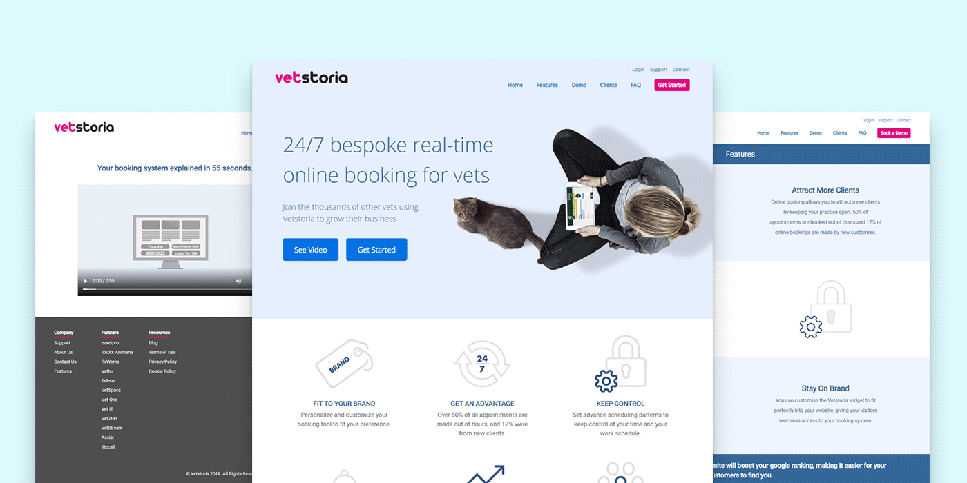 Vetstoria old website
By utilizing this data as a base, user flows for target the audience was developed with minimal steps to ensure the conversion of a visitor. During this time, the marketing team worked on adding the content developed into the wireframes. Each page was then carefully reviewed and cleansed ensuring that excessive and unnecessary data is removed and each page is no longer than 6 folds of the screen. Changes as such were made to the mobile version as well to ensure maximum optimization.
Computation of designs and developer hangovers were done using Figma and Zeplin, respectively. Communication between product/ marketing and development was maintained separately to ensure every point gets the attention and priority it needs.
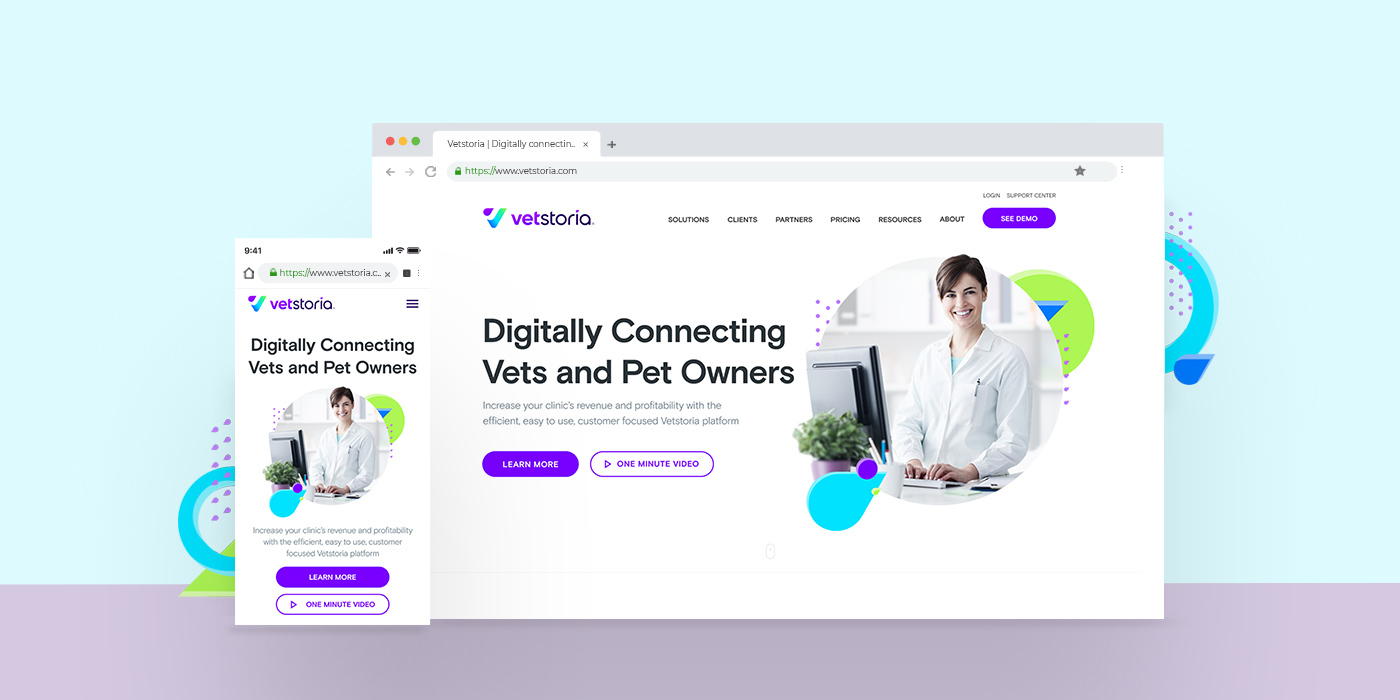
Figma enabled me to avoid using multiple tools for version control, prototyping, and collaboration. The site designs were done by incorporating and extending brand guidelines.
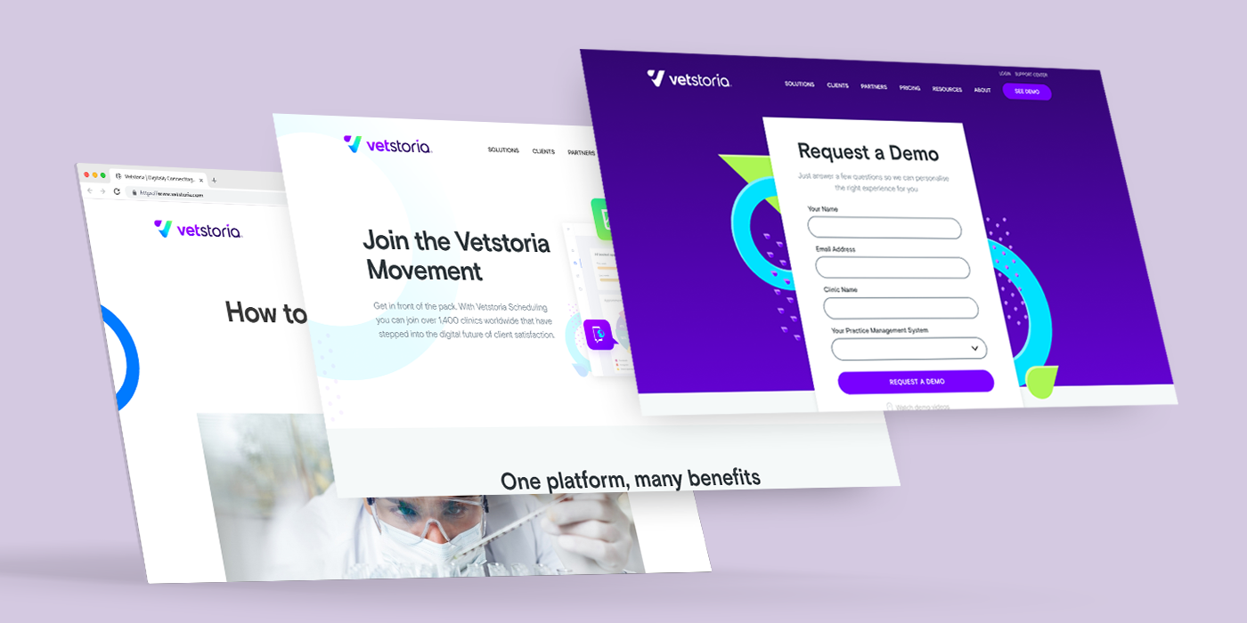 New website designs
Layouts and components were designed to support SEO and align with third-party integration guidelines (Intercom custom widget, existing support ticket system). Guide graphics were created as placeholders for proposed future sections and for places where the contents weren't finalised.
Two rounds of internal evaluations were done with employees on major pages to identify areas we need to improve. A-B tests were planned to evaluate alternative design options. Once the final amends were done, designs and instructions were handed over to the development and growth teams respectively.
Vetstoria mobile interaction concept